iOS 26 was supposed to mark the beginning of a new chapter for Apple's user interface. It's one of the more significant upgrades to the software in recent years, introducing Liquid Glass, a new UI element meant to be expressive and evocative.
When it was first shown on stage at Apple's WWDC event, Liquid Glass applied bold and highly translucent effects across various UI elements such as the control center, widgets, and more. These effects were meant to showcase depth and refract their surroundings, much like actual glass does.
However, as iOS 26 betas have progressed over the past few weeks, the Liquid Glass effects have been toned down significantly, the change is particularly jarring when going from beta 1 to beta 2. Early users had flagged legibility issues as the effects had negatively impacted the ease of use.
Apple had to quickly set things right but despite all of the hype built up for Liquid Glass, it appears the company hasn't quite nailed the vision for it yet. The latest beta has dialed back the Liquid Glass effect even further with reduced transparency across the UI and darker navigation bars to improve contrast and clarity.
What was essentially an aesthetic front-loading of changes ended up revealing a clear lack of vision, which is not something you often see from Apple. Sure, Liquid Glass made a big visual splash early on, but it lacked staying power due to usability concerns in the real world. It's not a good look for the company as it just shows even the mighty Apple is unsure where it wants to take its software.
On the other hand, Samsung's vision for its software has had exceptional clarity over the past few years. The company has introduced meaningful, not fanciful, changes that it hasn't had to walk back like Apple's doing with Liquid Glass.
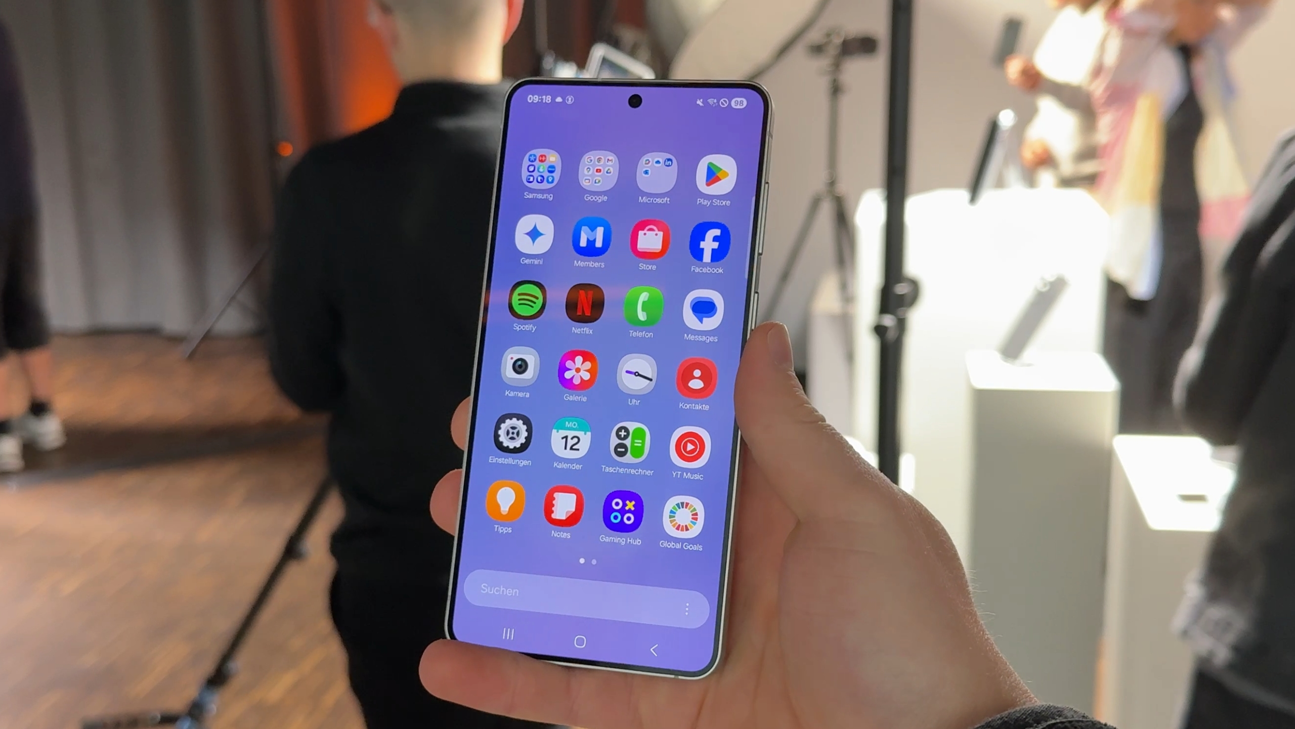
One UI 7 brought one of the biggest visual overhauls for Samsung's custom software. The beta program was launched to iron out the final gremlins, as beta programs normally are, not to make significant changes to one of the UI's biggest selling points. One UI 8 doesn't rock the boat, rather, it shows stability being at the core of the design process behind it.
Samsung's software efforts now also focus a lot more on just the design, they deliver deep functionality improvements. From enhanced privacy dashboards to powerful AI capabilities and industry-leading support commitments, software was once a department in which is seriously lagged, it's now one that's enticing people to buy its devices.
Perhaps it's the burden of perpetual innovation that's weighing Apple down and giving its software an identity crisis. Its fan base still expects grand ideas like Liquid Glass but the lack of a strategic vision forces Apple to beat a retreat once they fall short in real world conditions.
It doesn't look good as it reveals a fragile perception of leadership. The more Apple finds itself in a situation where it has to walk back features, the more visionless it appears against Samsung which has taken one of its biggest weaknesses and turned it around into its biggest strength.
The post Samsung’s One UI has vision while Apple’s iOS 26 suffers an identity crisis appeared first on SamMobile.


 Loading ...